
Marc Chagall (1887-1985), a Jew born in Vitebsk, Russia, would become a renowned artist. His father was a herring merchant, and his mother sold groceries from their home to support their nine children. Chagall’s memories of his childhood under the Pale of Settlement, the pogroms established in Russian to greatly restrict Jews, his Hasidic Jewish upbringing, and memories of his beloved home town Vitebsk were the strongest influences on his art. As a Jew he was not allowed to attend school, except Yeshiva (Jewish school), but he was highly intelligent. His mother enrolled him in a regular high school when he was 13. He recalled his mother’s actions: “In that school, they don’t take Jews. Without a moment’s hesitation, my courageous mother walks up to a professor. She offered the headmaster 50 rubles to let me attend, which he accepted.”
At school, Chagall watched a fellow student draw. In his autobiography My Life (pub. 1923), he described it as “like a vision, a revelation in black and white.” Never having seen art before, Chagall knew what he was meant to do. He moved to St Petersburg in 1906 to attend art school. He studied under Leon Bakst, a Russian Jewish artist who would become famous as a designer of sets and costumes for Diaghilev’s Ballet Russe. Bakst also introduced Chagall to the theater. Chagall remained in Russia from 1906 until 1910. He was able to move to Paris in 1910, when a member of the Russian Duma who liked him and his art, gave him a monthly stipend of 40 rubles to support his art.
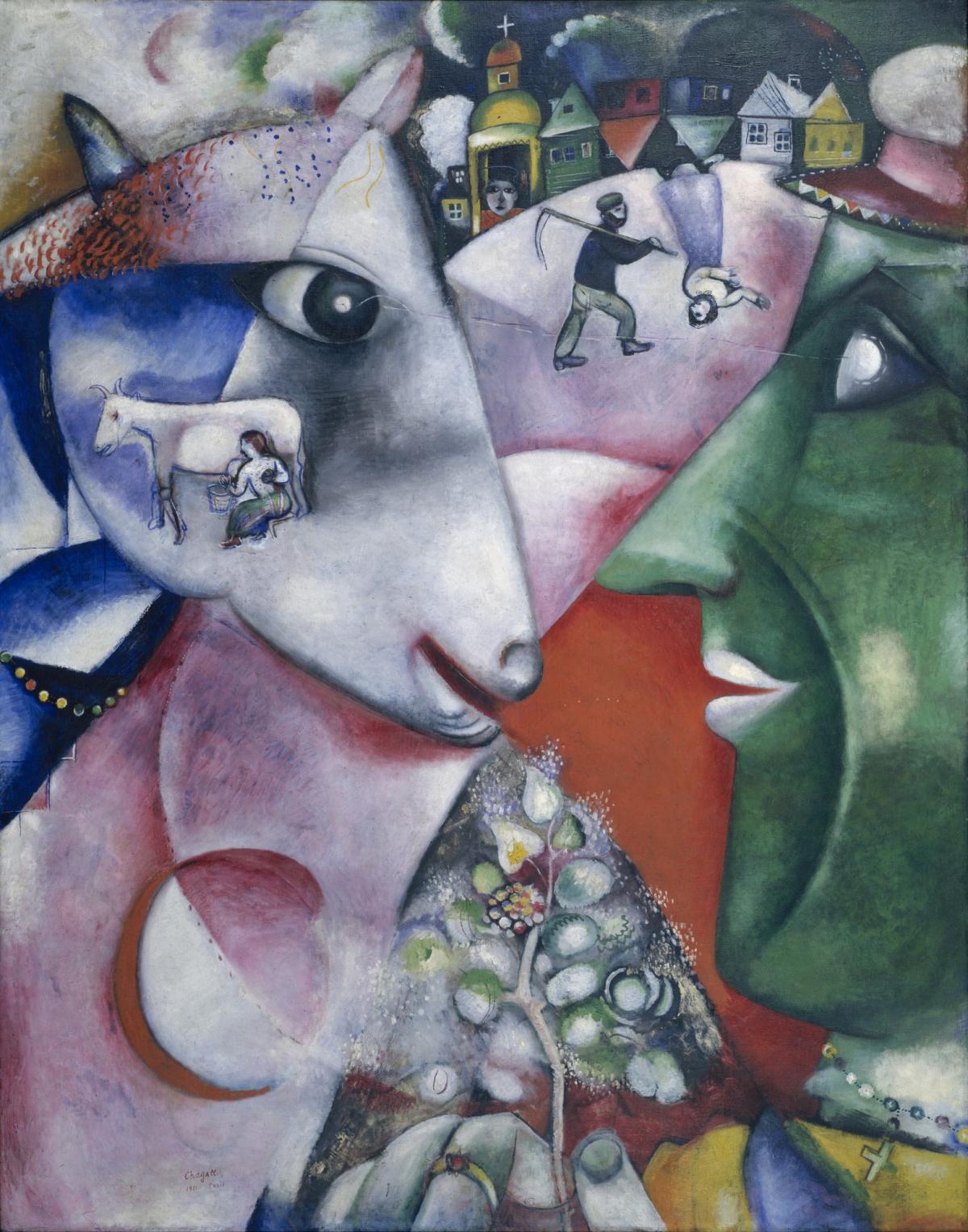
“I and the Village” (1911)
Chagall saw the art of Picasso and Matisse and the other young artists of Cubism and Fauvism, and the various other “isms” then in Paris. He began to realized that Jewish traditions so much a part of his life were in decline and that he needed to document them. “I and the Village” (1911) (75”x 60’’) (MoMA) is one of his earliest paintings in Paris. Vitebsk, a busy crossroads for trade, had both churches and synagogues and a large Jewish population. Influenced by the vibrant colors of Fauvism, and the geometry of Cubism, Chagall created a dream-memory of his hometown.
Looking eye-to-eye at each other are the green face of a Jew, Chagall, and the large multicolored head of a lamb. They recognize each other and smile slightly. They are joined compositionally by a large multicolored, overlaid circle, symbol of inclusion and wholeness. Connecting the man and the lamb is a triangle formed by a hand holding a flower. The triangle extends from the center bottom of the composition to the lamb’s mouth. Enclosed in the lamb’s head is the image of a woman milking a white cow. Scenes of Vitebsk that include farm animals such as cows, sheep, chickens, and roosters are common images drawn from Chagall’s childhood memories.
Floating between the foreheads of the two main figures, are a farmer carrying a scythe and a woman dancing upside-down. Behind them arranged on a circular ground is the colorful town of Vitebsk, including a Russian Orthodox church, its dome bearing a cross, and five brightly colored houses, two of which are upside down. People and objects float in the air devoid of gravity, and existing upside-down, become another characteristic of Chagall’s art. The painting is carefully composed using primary and secondary colors and overlapping geometric shapes. Chagall created a space based in reality, but a world beyond. “I and the Village” combines Chagall’s memory, dreams, and fantasies that are so much a part of his art.
Why Chagall depicted himself as green is a question. The cultural identify of Jews was a major issue in Chagall’s time. He wrote, “Back there (Russia), still a boy, at every step I felt—or rather people made me feel!…that I was a Jew.” Throughout his life, Chagall had to deal with the perception that Jews were less than human. He frequently used green for himself and fellow Jews because to him the color green symbolized rebirth and joy.

“The Fiddler” (1912-13)
Chagall loved Paris, but in his early years there he struggled to learn the language and to earn money. “The Fiddler” (1912-13) (74”x 62’’) was painted on a brown checkered tablecloth. He leaves portions of the tablecloth unpainted on the fiddler’s shoes, pants, coat and in the brown of the houses and churches. Music and dance were an important part of the Hasidic tradition, seen as a way to commune with God. Fiddlers played throughout a person’s life, from birth, to marriage, and at death.
Chagall’s fiddler stands on one leg on the roof of a house, while his other leg kicks out into space as he dances. At his left, dressed in native costumes, three small figures dance to the music. A blue tree at the right shelters white and yellow birds. A figure in yellow floats in the clouds above the fiddler. Chagall cleverly played white triangles against the partially black earth and sky. Despite the heavy black areas that surround the fiddler, or perhaps because of them, the painting is a haunting reminder of life and death.
“Paris, no word sounded sweeter to me!” Chagall reveled in his new life: “No academy could have given me all I discovered by getting my teeth into the exhibitions, the shop windows, and the museums of Paris.” Paris proved to be one of the major turning points in Chagall’s life, although he remained homesick for Vitebsk. After his initial adjustment period, he became a welcomed member of the Paris avant-garde.
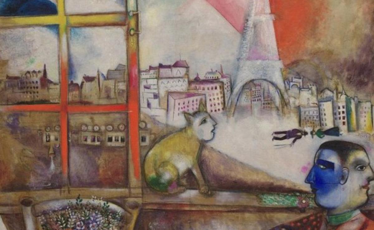
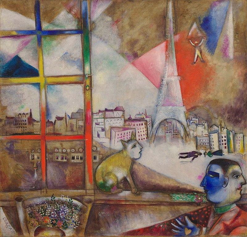
“Paris Through the Window (1913) (53” x 56”) (Guggenheim Museum, New York) expresses his delight in Paris and the influence of his new friend and colleague Robert Delaunay. Delaunay had developed a style called Orphism (named after the Greek musician) that brought bright colors to Cubism and had influenced the use of pure colors in “I and the Village” and “The Fiddler.”
Positioning himself in the lower right corner, Chagall is Janus, the two-faced figure. The face at the right looks back to Vitebsk, while the blue face at the left looks to the future. The window is rainbow colored. A yellow cat with a remarkable human face sits on the window ledge and looks into the sky, where a parachutist, Chagall, floats past the Eiffel tower. A man wearing a black suit and carrying a cane, and a woman in green and black wearing a hat, float in the white clouds at the base of the Eiffel tower. The city of Paris stretches across the canvas.
Smaller details catch the viewer’s attention. On the ground behind the window, a steam train puffs along, upside down. In front of the window, a chair supports a yellow pot full of brightly colored flowers. Beside it, in a light beige triangle is the artist’s signature. The two-faced portrait of the artist includes his blue fingers spread open to display a yellow heart on the palm of his hand. Is Chagall in love with Paris? Yes. Is he in love with Vitebsk? Yes. Is he in love with a woman? Yes.
Through his art, Chagall tells many stories of his life and loves. He uses his art to express his response to world in which he lived: World War I, the Russian Revolution, Nazism and World War II, and the aftermath of war.
Closing note: This article deals with Chagall’s early art. His long career will be discussed in future articles in the SPY, as his art has much to say about the world today.
Beverly Hall Smith was a professor of art history for 40 years. Since retiring with her husband Kurt to Chestertown in 2014, she has taught art history classes at WC-ALL. She is also an artist whose work is sometimes in exhibitions at Chestertown RiverArts and she paints sets for the Garfield Center for the Arts.